Warhammer 40,000: Grey Knight Nemesis Dreadknight review
The Grey Knight Nemesis Dreadknight (which for my sanity’s sake I will refer to as the DK, just don’t start thinking I’m talking about a publisher) is probably the most talked about new thing in the Grey Knights release. It’s something quite different from anything they’ve released before, perhaps being most similar to a Penitent Engine in looks or a Wraithlord in terms of game mechanics. This review is going to focus solely on the model, the aesthetics and how it builds, rather than how it plays “in game”.
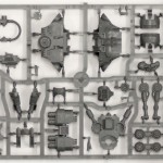
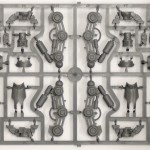
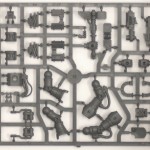
Like most of the recent kits from Games Workshop, the sprues are densely packed. Perhaps they’re getting a bit too packed though, it seems to be getting increasingly difficult to cleanly clip components of the frames these days. Mercifully, there are not too many mould lines to clean up, though a major gripe is how many of the attachment points to the frame are on the smooth flat armour surfaces, which need a lot more care and attention in order to get the smooth finish that a model like this requires.
GW have also started numbering the components on the sprues, to match with the illustrations on their instructions. This is a good idea, but it’s an idea that has been poorly executed. There seems to be no logic to this numbering. If for instance components 5 and 6 are to be glued together you would suppose that they would be next, or at least close, to each other on the sprue. In actual fact they were not even on the same sprue, part number 5 instead sitting happily amongst the 70’s and 90’s on another of the (in total) 3 sprues supplied. A minor annoyance, but one that could have been easily avoided by using more intelligent numbering.
The Sprues
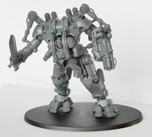
When looking at the preview pictures, the fairly static poses that the figures were given caught the eye; leaving me wondering whether this was intentionally done by the painter to show off the detail, or a limitation of the kit. Well, on building the legs it became apparent that it was the latter. Not only have the designers not given you an out of the box way to dynamically pose the legs, they have designed the model to actively make it difficult to achieve such a goal, because of the way the terminators pilots legs attach to the DK. When the DK has legs that are so much longer than those of the dreadnought it really feels like an opportunity has been missed, especially when you think of the Sentinel kit and how the newer version came with improved knee joints for extra pose-ability.
The same is also true to a lesser extent with the upper torso, the pistons that control the movement of the upper arms effectively prohibit completely free movement of the limbs, and the arms are a bit too short to allow a two handed sword holding pose. Speaking of the weapons, there are only parts to fully build two of the three ranged weapons (the Heavy Psilencer, the Heavy Psycannon and Heavy Incinerator); this is also the case for the three right-hand close combat weapon options (The doomfist, Nemesis Greatsword and Nemesis Daemon hammer) [what is it with GW and their increasingly stupid names ? – ed], though those with some sculpting skills should be able to quite easily build the missing part of the hand that’s required. This would then mean that with a bit of magnetic magic you have swappable weapons options for your DK.

Now we come onto my thoughts on the look of the model, which admittedly are purely subjective, so you may feel inclined to disagree. As Paul said in his Grey Knights preview piece, it’s difficult to say whether I love or hate this kit, I guess in reality it is a bit of both. I like the overall slickness, but I think it has been spoiled by some of the additions like the pistons controlling the arms, and the “headless horseman” aspect of the design. Then there is the writing, technically a great achievement, again showing how far GW have come with plastics, but with the words themselves just a touch silly – I think I would have preferred that they stuck to the cod-latin stuff.
And then there is the pilot, in what can only be described as a baby harness.
Overall it’s aesthetics are as confusing as the numbering on the sprues. Is this supposed to be a slick technological marvel, or something only half a step more advanced than a sentinel ? It has the smooth armour, but then a very static pose and pistons etc sticking out all over the place. As alternative comedians like to say: “what’s that all about ?”
So a lot of annoyances for me in the look and design of this kit, but despite all of that I wouldn’t say it was bad, it’s just a bit of a disappointment considering what they nearly achieved but didn’t quite. Given a few months I’m sure a number of guides will be published on converting this into something that will realise it’s potential a bit more, and it’s on the basis of the kits potential that the Nemesis Dreadknight gets:
Good knight and good luck: 6/10


WELL looks impressive but no not getting in to the army. Heck, I need to update me Space Wolf army and my Marine army. WKJR
Nice review and quite to the point.
I am in the process of giving the model are more dynamic pose and it is work. Luckily not as much as I expected it to be. But more then I would like to do in the first place with a model that expensive. 😉
An easy fix to the posability of the arms is to cut off the small tab on the part that is put in the shoulder socket. With he tab you can move it just up and down, with out it the piece can move in the socket back and forth as well.
I am glad that I got mine form our stores Black box but still three of them appropriately dynamised would look spiffy I think.
@WKJR – Lol. Unfinished armies are the bane of the wargamer.
@CplHicks – Nice tip for posing the arms. I’m probably going to leave the pistons off completely because I want to have the heavy weapons clip on and off the model.
This is by far the ugliest kit I have EVER seen pushed out by GW. I’m sorry, but what were they thinking, and how is this considered a “Dreadnought”?! Aren’t Dreadnoughts supposed to be walking coffins containing the bodies of long dead heroes? Oh yeah, they are!
So what I’m looking at here is a Grey Knight sentinel, this is not a dreadnought and its armor shouldn’t be anything above 10 across the board. But let me guess, there’s some corny explanation as to why the Grey Knights Dreadnoughts are piloted by guys in terminator armor.
I know the numbering doesn’t always make sense with the frames, but as GW explained in White Dwarf when Assault on Black Reach appeared on shelves, the components are placed to save space and therefore plastic rather than to ease construction. Hence using AoBR as an example there are Ork bits next to the Dreadnought and so on. It is a shame that the legs are so static but at least it provides rigidity and stability to the lower part of the model.
Normally I like helmet-less marines, but on ths thing it looks completley stupid.
Pingback:Lots of stuff to read… » ¡bitzkrieg!
Pingback:Grey, dear friend, are all those theories… » ¡bitzkrieg!